Project overview
Ring's subscription platform converted above average, so for years nobody touched it. Why fix what is already working?
The org came to me as design support for future content updates. I took it upon myself to look deeper, ran a full diagnosis, and came back with a cross-platform monetization overhaul.
The initial picture
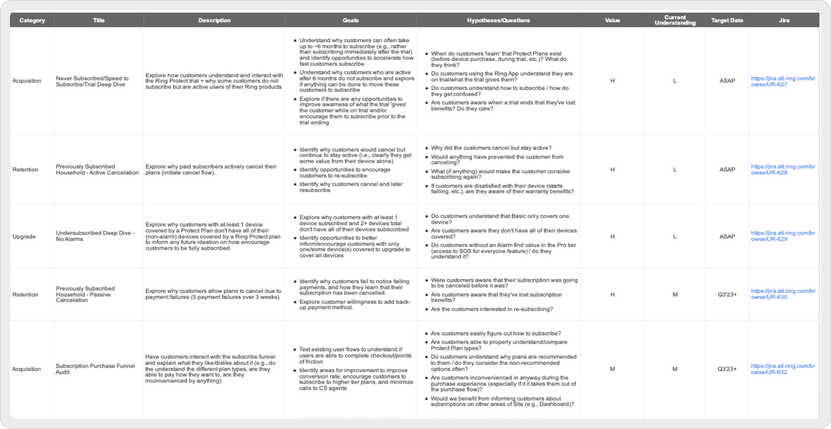
Five tracks. The last column is how little we knew.
Nobody had scoped this as a problem, so the first thing I produced was a research plan: the funnel split into acquisition, retention and upgrade, the hypotheses I wanted killed or confirmed, and every row rated twice for what the answer was worth and how little we understood.
Five tracks came out of that table. Every signal below traces back to one of them.
Signals and strategic diagnosis
My early research had already delivered the leads. To move the needle I just had to synthesize the signals:
The 30-day cohort dilemma
Losing recorded video history triggers immense loss aversion. Trials end 30 days after activation and sign-ups spike on that exact day. We were harvesting a deadline.
The cross-platform chasm
No native bridge, so purchase intent cooled down during the handoff. Close to 100K users on average found the value inside the app, and App Store fee policy forces the transaction onto the web.
The feature comprehension deficit
Subscribers were unaware of every benefit except video storage. UXR unraveled the commercial bottleneck: if storage is all you perceive, there is zero incentive to upgrade.
The pogo-sticking loop
80% of the funnel enters on mobile, and comparing plans meant bouncing between a list and a deep-detail screen. Heavy decision fatigue, value compared from memory.
The laundry list fallacy
Technical jargon and endless feature grids where a value proposition should be. Expert audits proved the legacy checkout never articulated core user value at a glance.
The post-purchase void
We were treating checkout success as a dead end. Nothing prompted anyone to configure or activate what they had just bought, and our activation rates and TTFV paid for it.
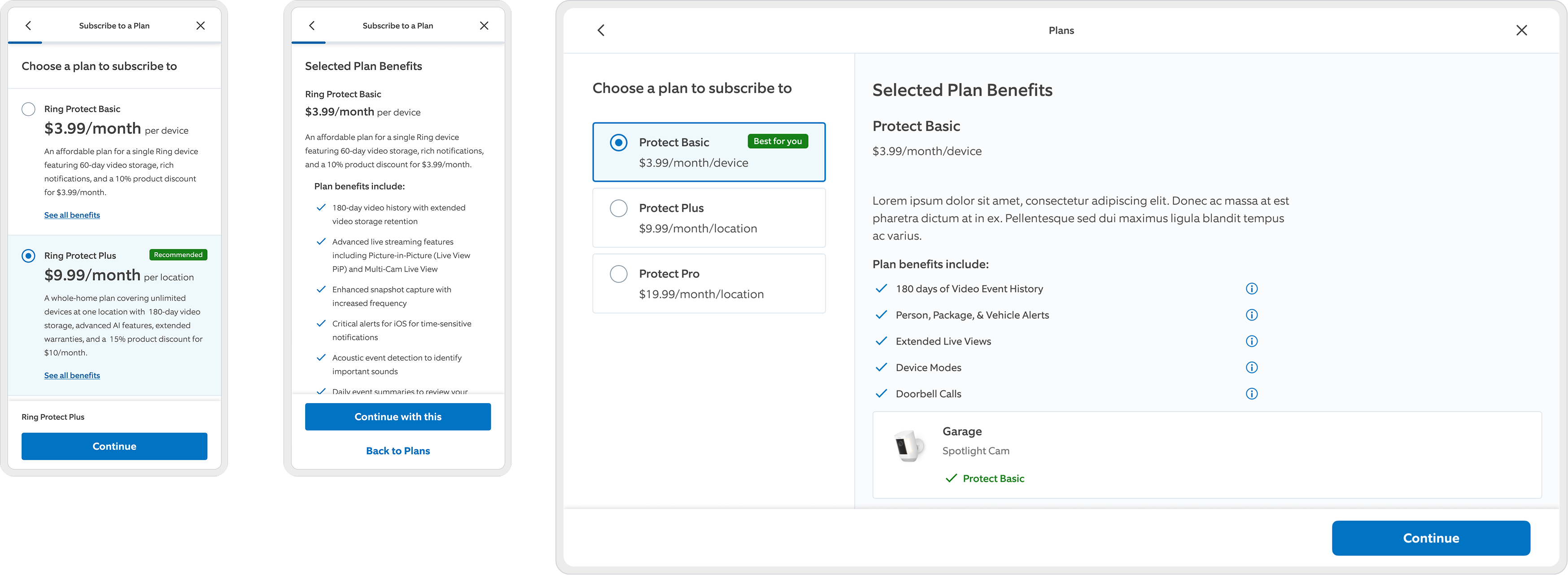
Wall-to-wall copy on all three surfaces. Nothing here survives a ten-second scan, which is what a purchase decision gets on a phone.
Enter Project Live Oak
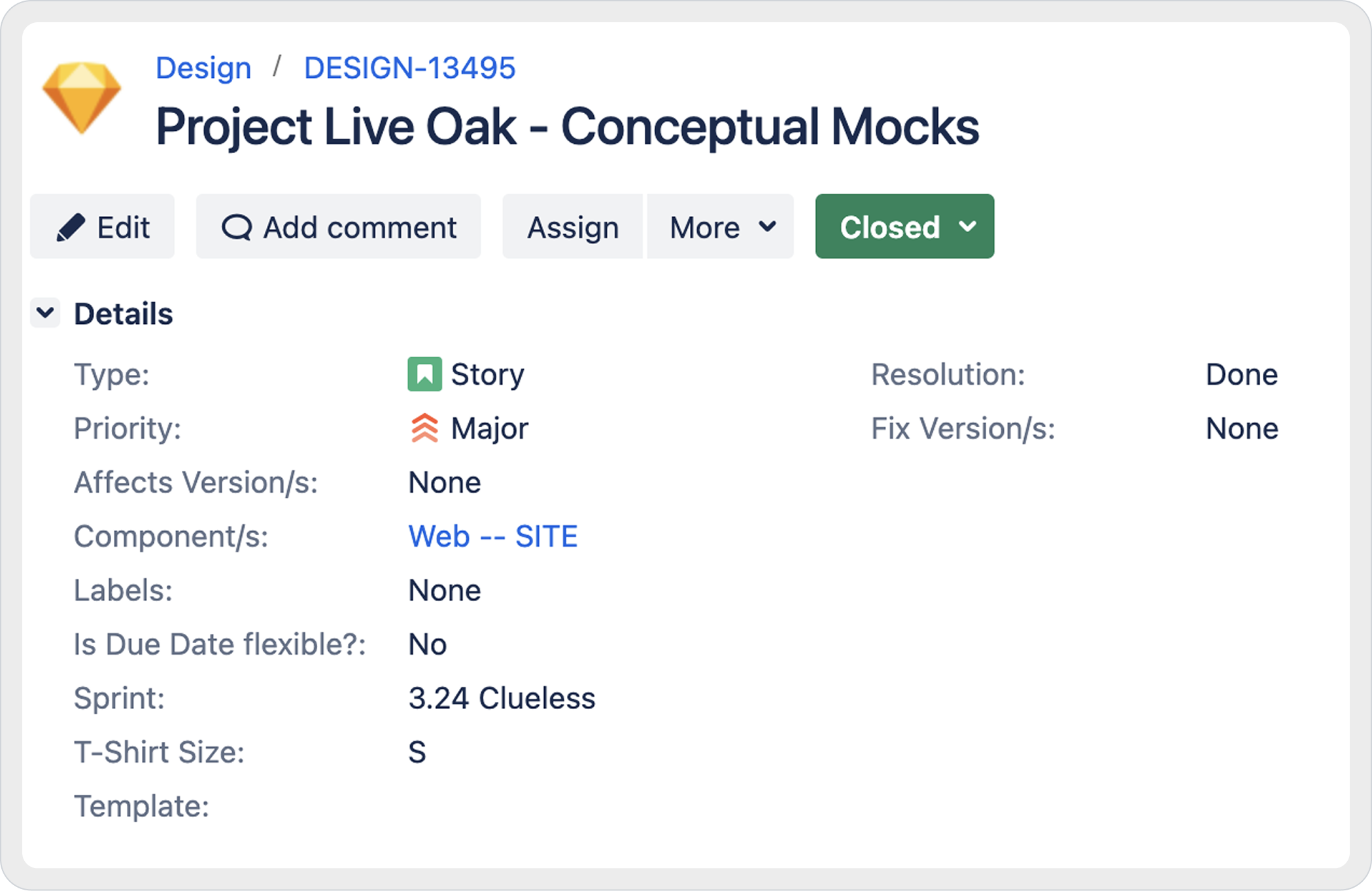
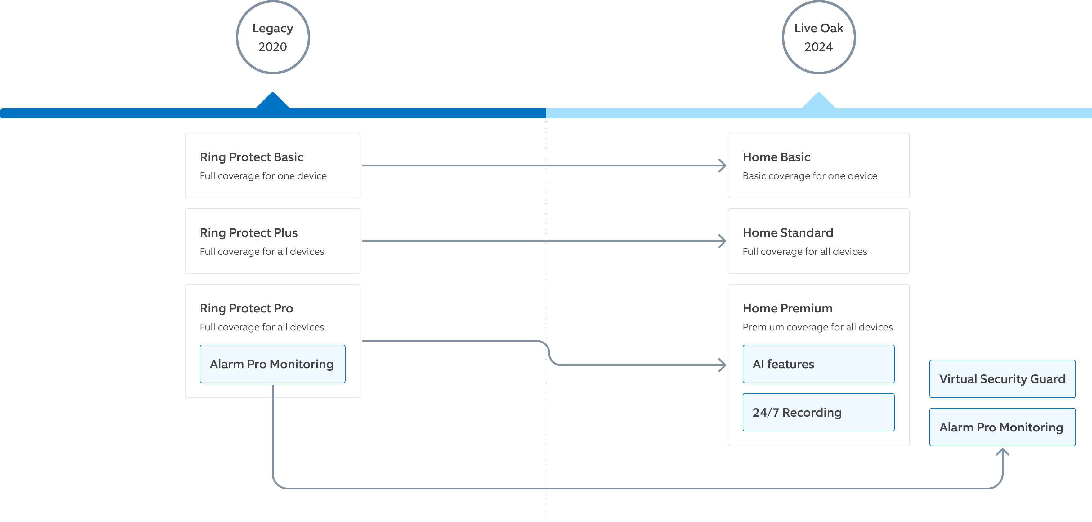
One sprint of conceptual mocks, and the monetization model it quietly rewrote.
In 2024 the business rolled out a new plan strategy, and my part arrived as a Jira story: conceptual mocks, T-shirt size S, one sprint.
That ticket is my favorite artifact of the whole project. Underneath the cosmetic brief sat a 25% price increase on our most populated plan, Alarm Pro unbundled into a standalone add-on, and deprecated plan names. People freak out the moment they see a name they don't recognize on their bill. What's not to love?
Platform tenets
Before opening Figma I turned the signals into platform principles. They went on to settle most of the arguments that followed.
Ecosystem over interface
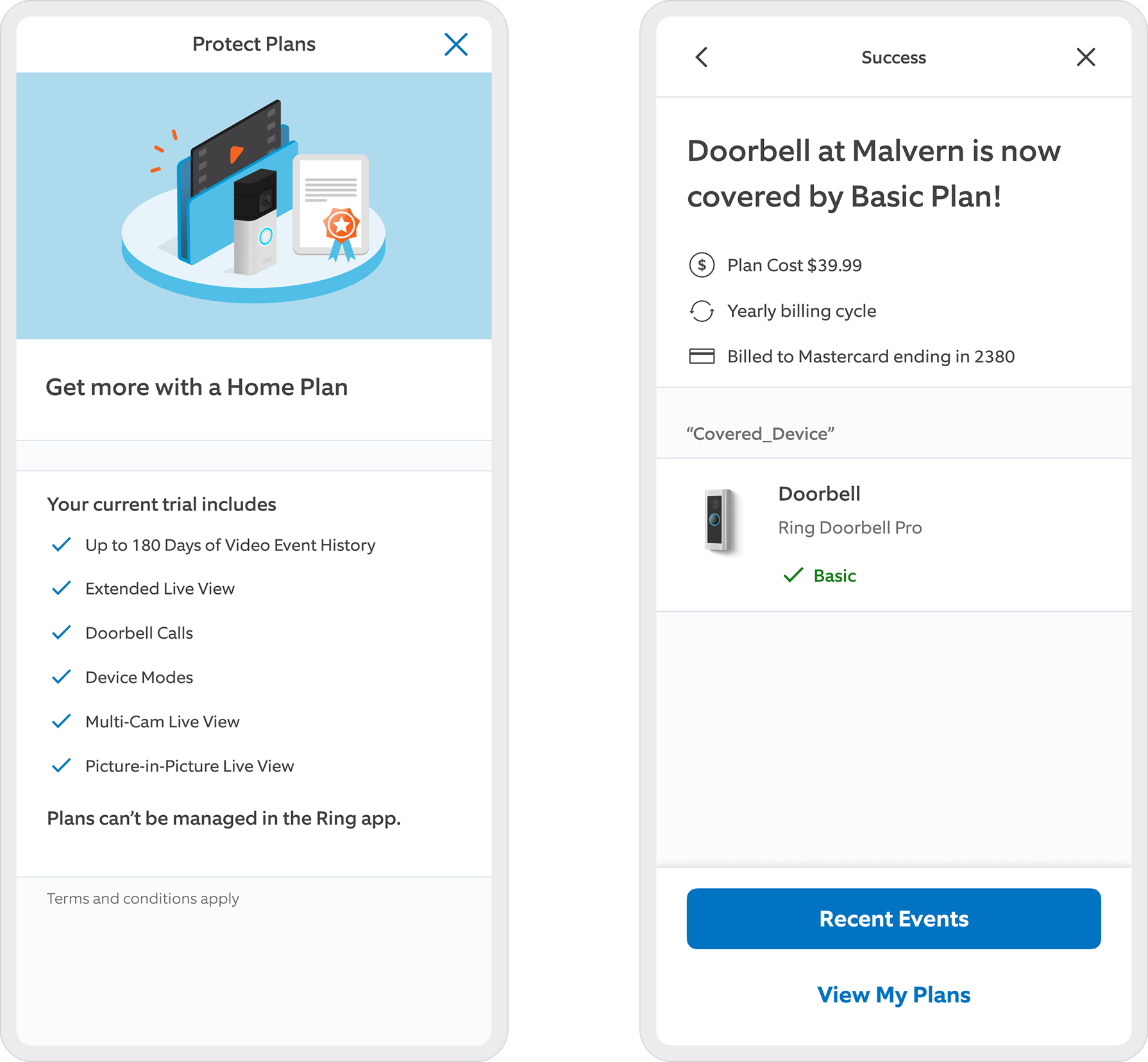
Read the line under the trial benefits: plans can't be managed in the Ring app. The app sold the value, handed you off to pay somewhere else, and the confirmation had nowhere to send you next. I refused to design checkout as an isolated transaction page.
Proactive discoverability
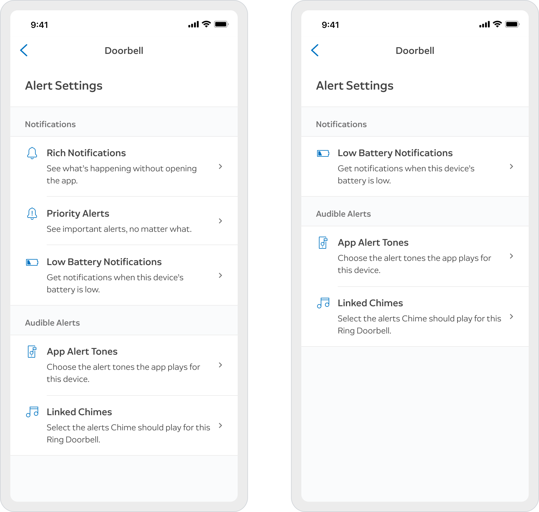
Same doorbell, two accounts. On the right, what a non-subscriber saw: the rows are gone. Nothing locked, nothing greyed out. Users shouldn't have to guess what they are paying for.
Comprehension over speed
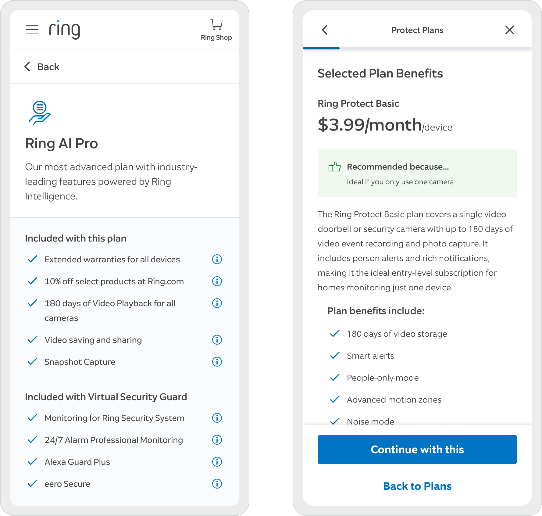
Fourteen checkmarks, no hierarchy, no reason given to care about any of them. What we shipped opens with Recommended because... ideal if you only use one camera. Early iterations tested worse on time-on-task and drastically better on comprehension. We took that trade every time. Full stop.
From strategy to execution
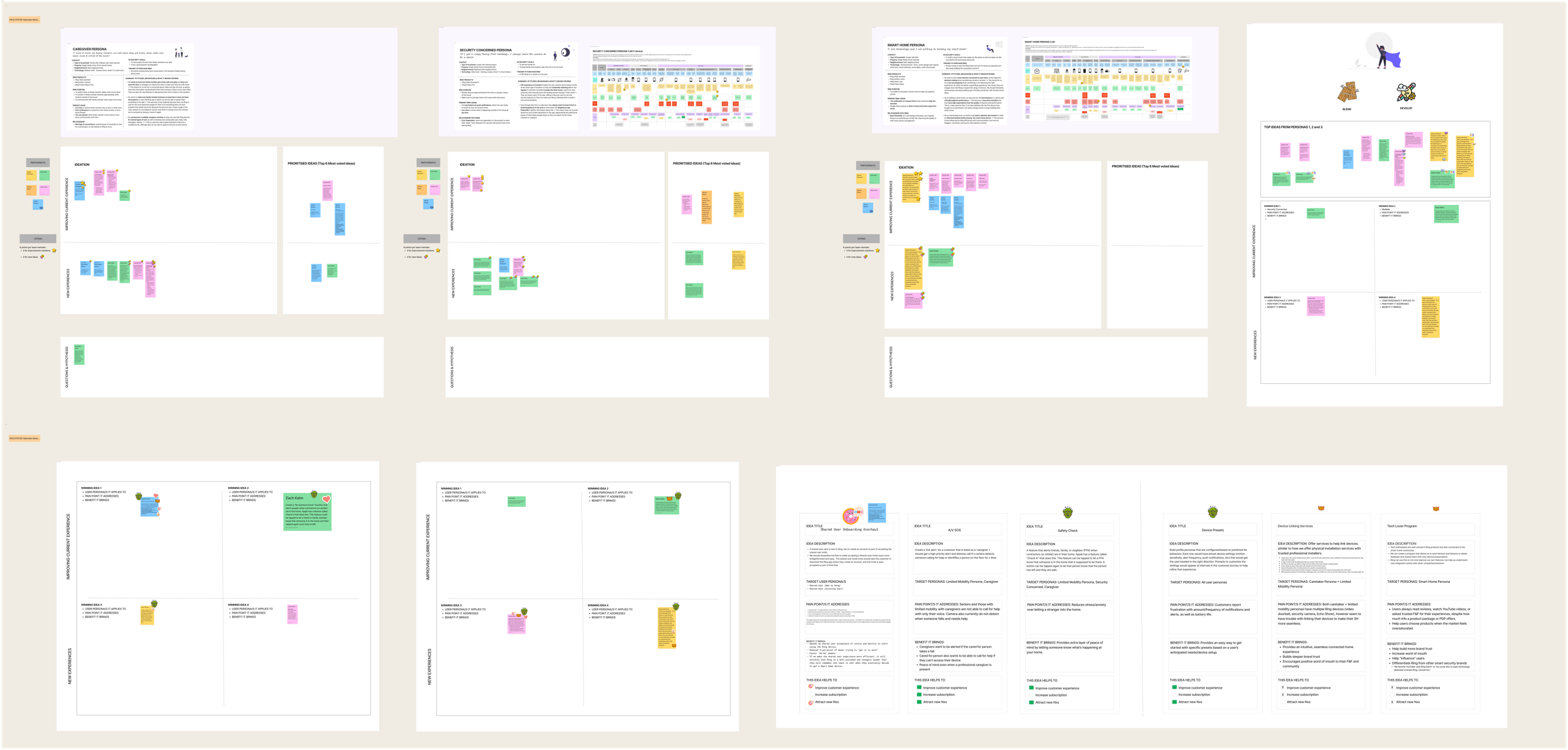
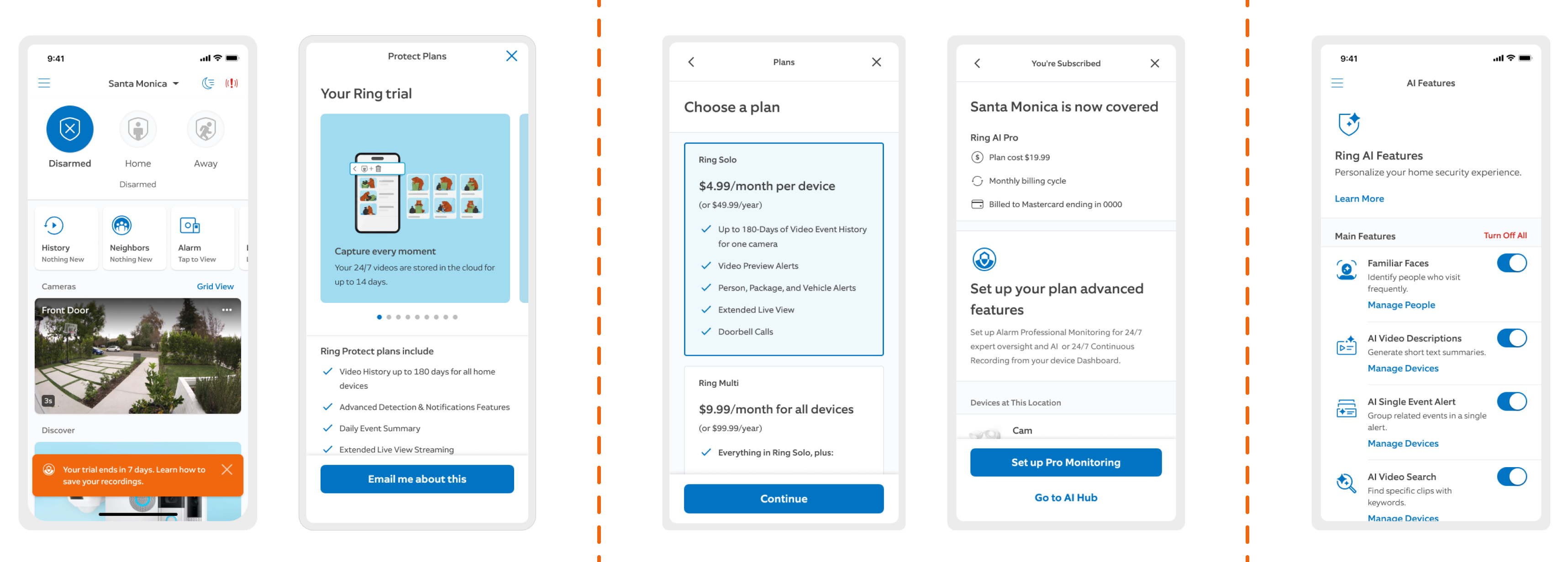
The session, and the five moments it converged on: in-app discovery, trial awareness, plan comparison, confirmation, activation.
We skipped the fully fledged design sprint and ran a focused four-hour session with Product, Engineering leads and Legal, mapping solutions against the opportunities the signals had surfaced.
It converged on one continuous experience: account onboarding, trial, in-app discovery, the purchase funnel and activation, wired into a single path, with an architecture that could scale it and a new pattern for every problem we had diagnosed.
Columns and simplification
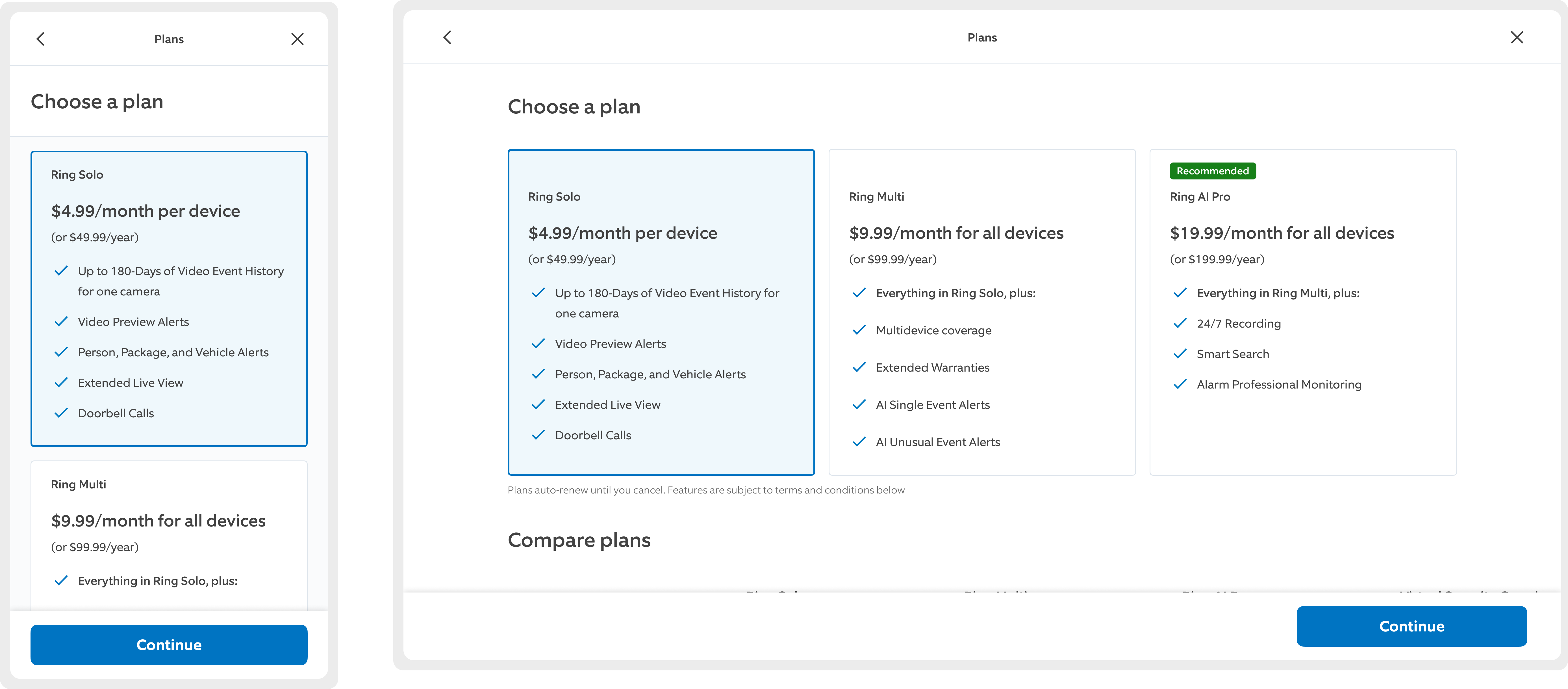
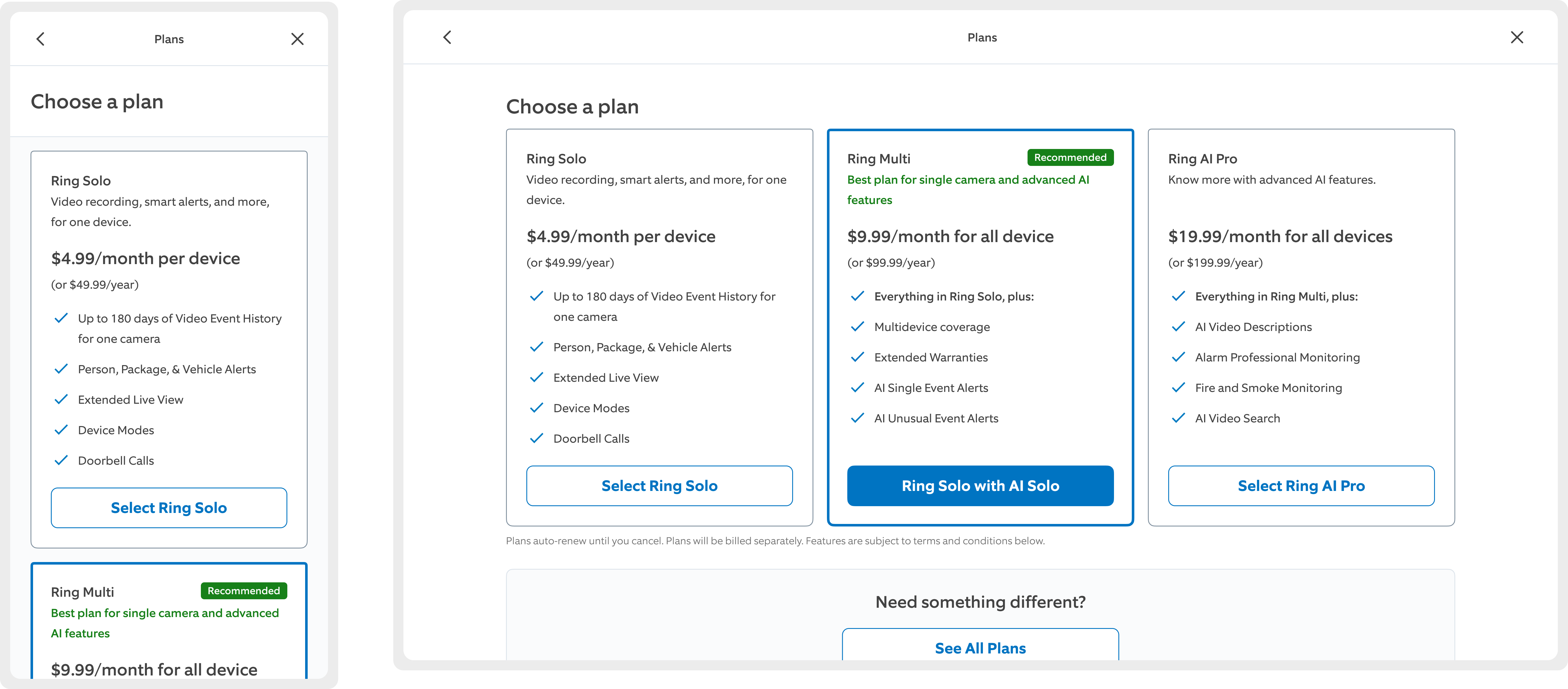 Columns Tiles
 Columns, the industry standard, benchmarked against Figma, Dropbox, Slack, Heap and Netflix. Tiles, forcing extreme content frugality to dodge a false floor on mobile. Columns won on the data: users spent longer with the cards and could then explain the benefits accurately.
I designed variation after variation of the core purchase experience, strictly tied to the tenets. I killed the pogo-sticking loop by pulling every plan into one responsive column view, and my product partner, UXR and I cut the feature list down to what research proved drove purchase intent.
Being ahead of schedule vis-à-vis engineering bought us testing time. 27 studies later, two candidates were left standing.
The psychology of intent
A generic "Continue" felt passive and caused friction. "Subscribe to Home Premium" felt like an intentional commitment, and it turned a thoughtless click into a conscious choice.
Disagree and commit
Leadership caught a glimpse of Tiles early and was completely sold on the aesthetic, and by then our timeline leeway with engineering had expired. I took the mature route, locked the design, and kept a clean A/B test in my back pocket for production data.
Scaling across device cohorts
Visible logic and copy have been intentionally obfuscated to respect NDA and confidentiality agreements.
Strategy is nothing without execution. Ring's user base is highly fragmented, so partnering with Product I segmented on two axes: device type (cameras, doorbells, alarm systems) and device density (single-device owners vs. multi-device households). Each cohort got its own recommendation logic, plan hierarchy and content strategy across 11 variations of the core flow.
Ingress points
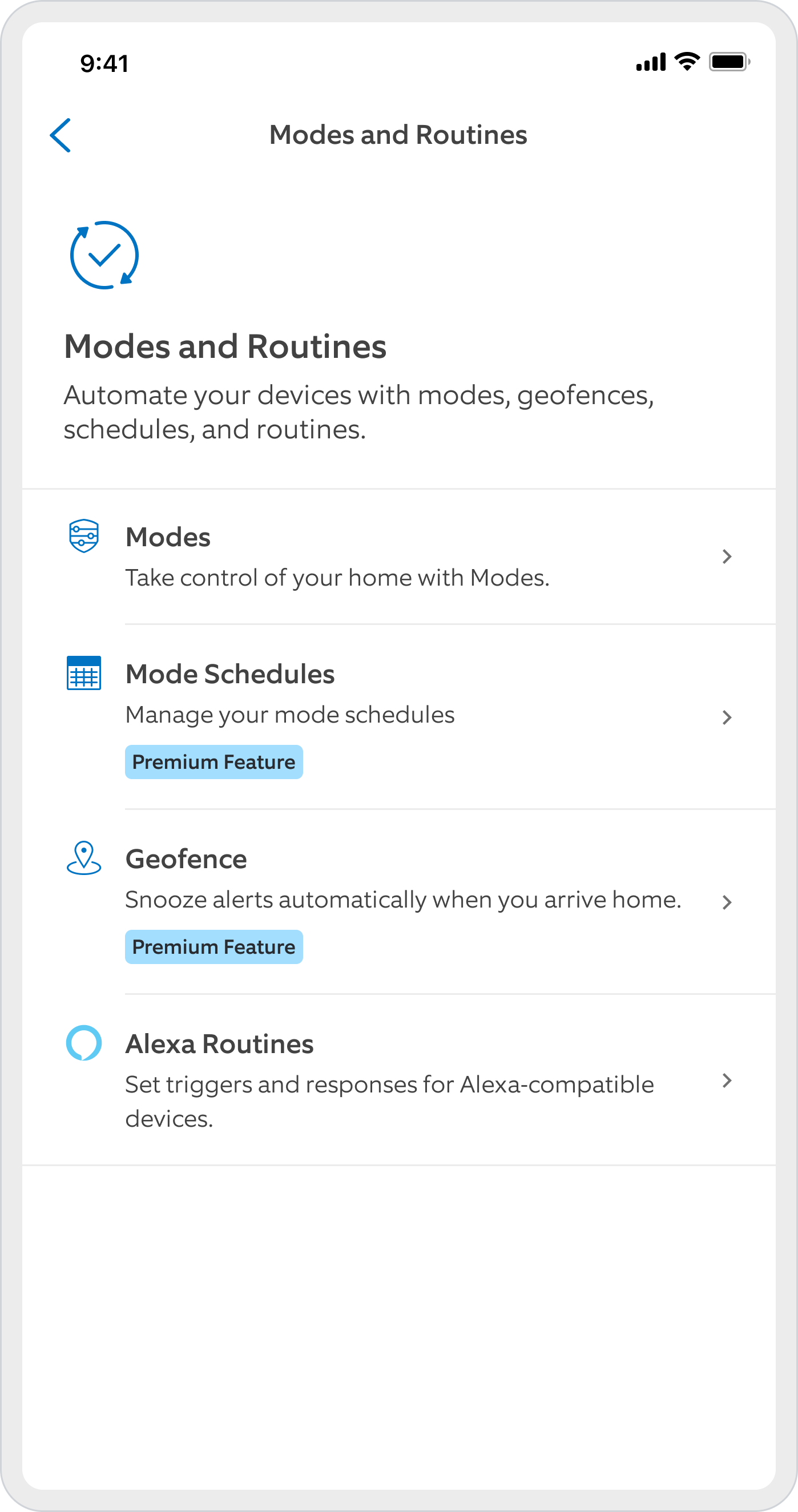
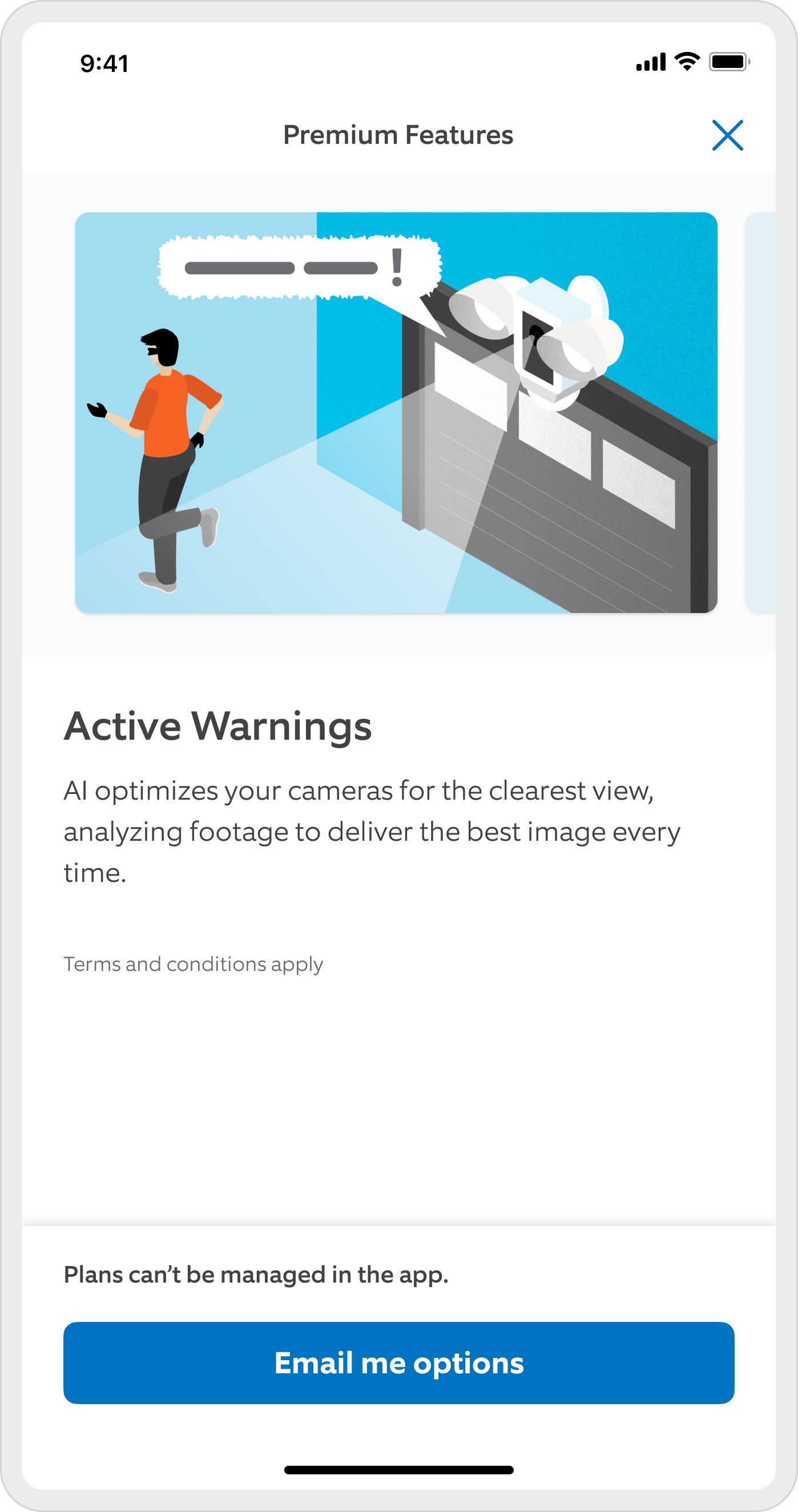
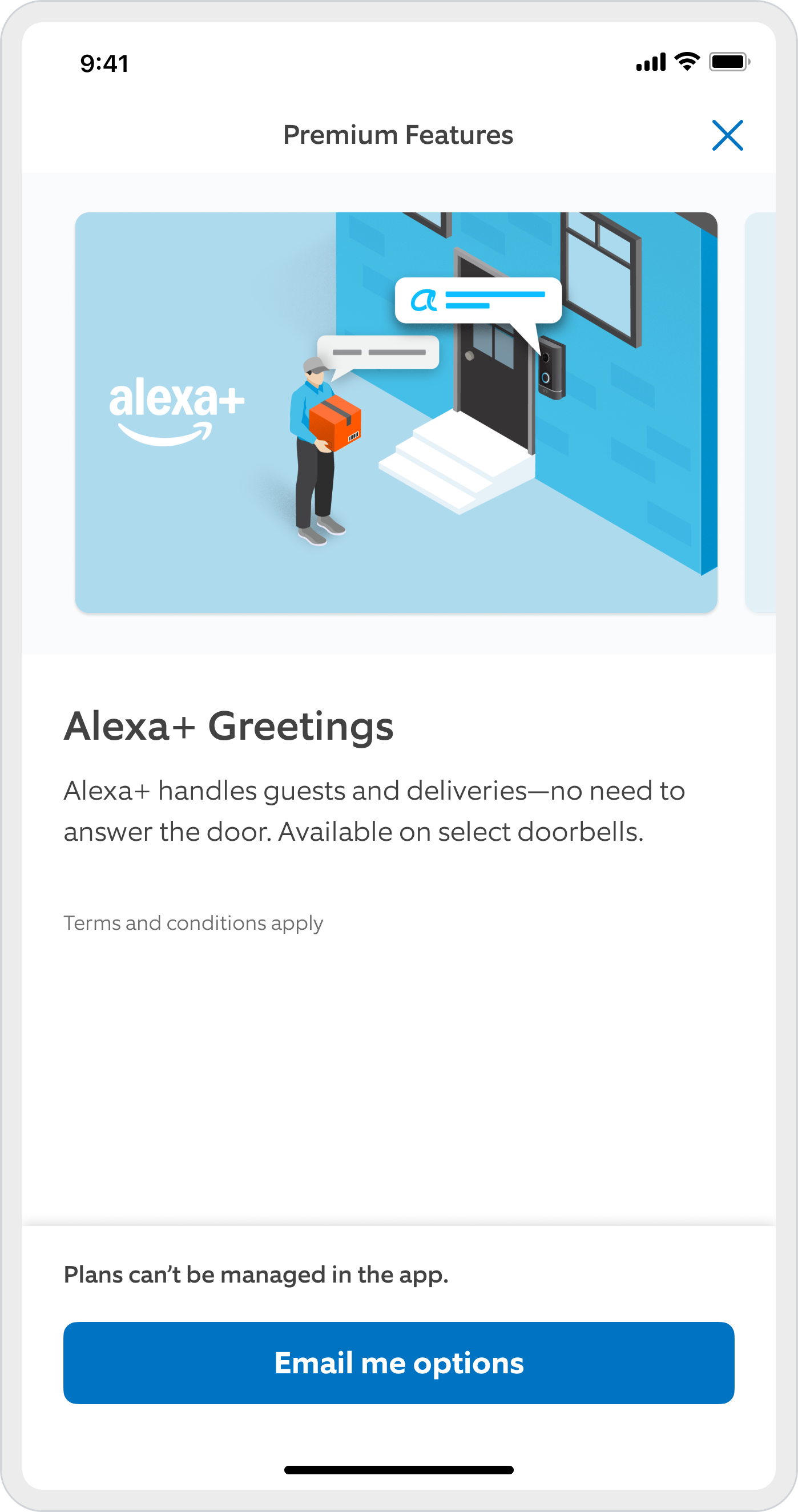
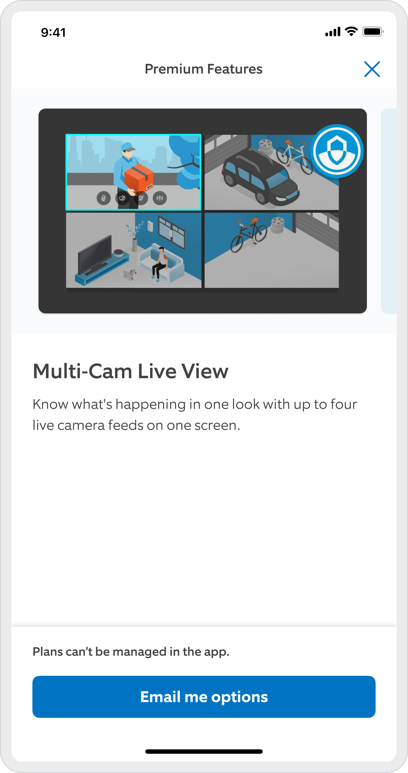
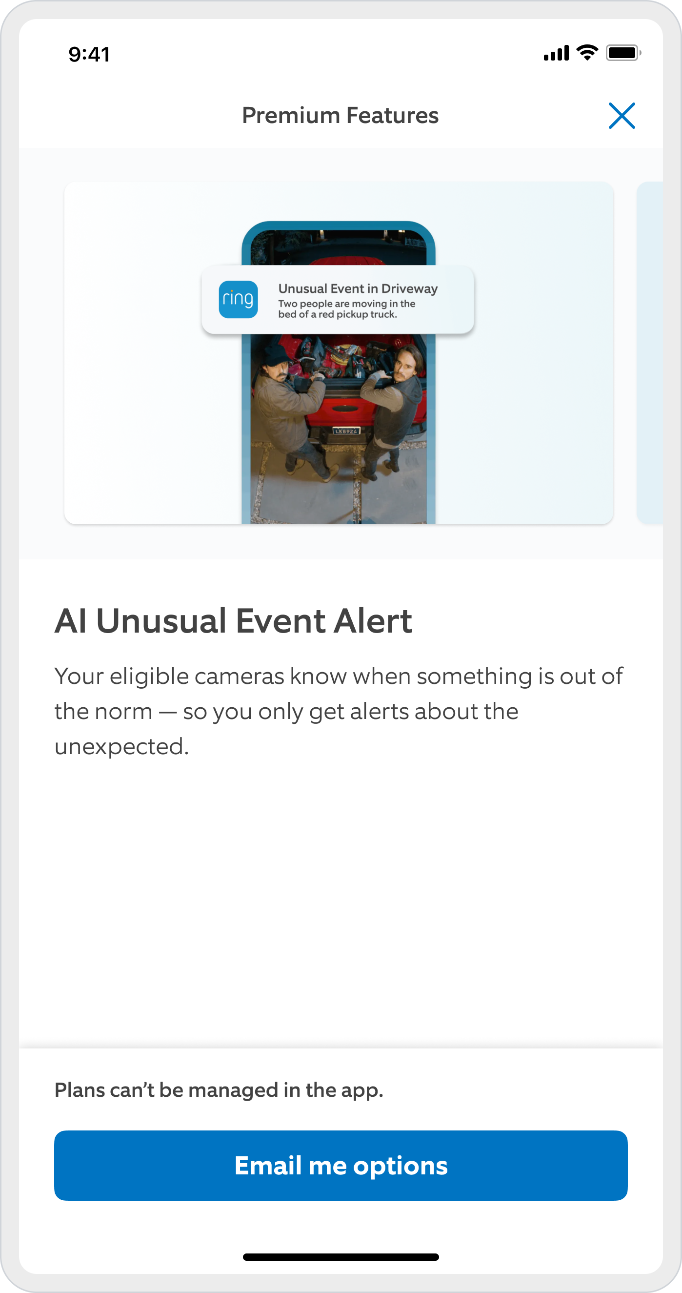
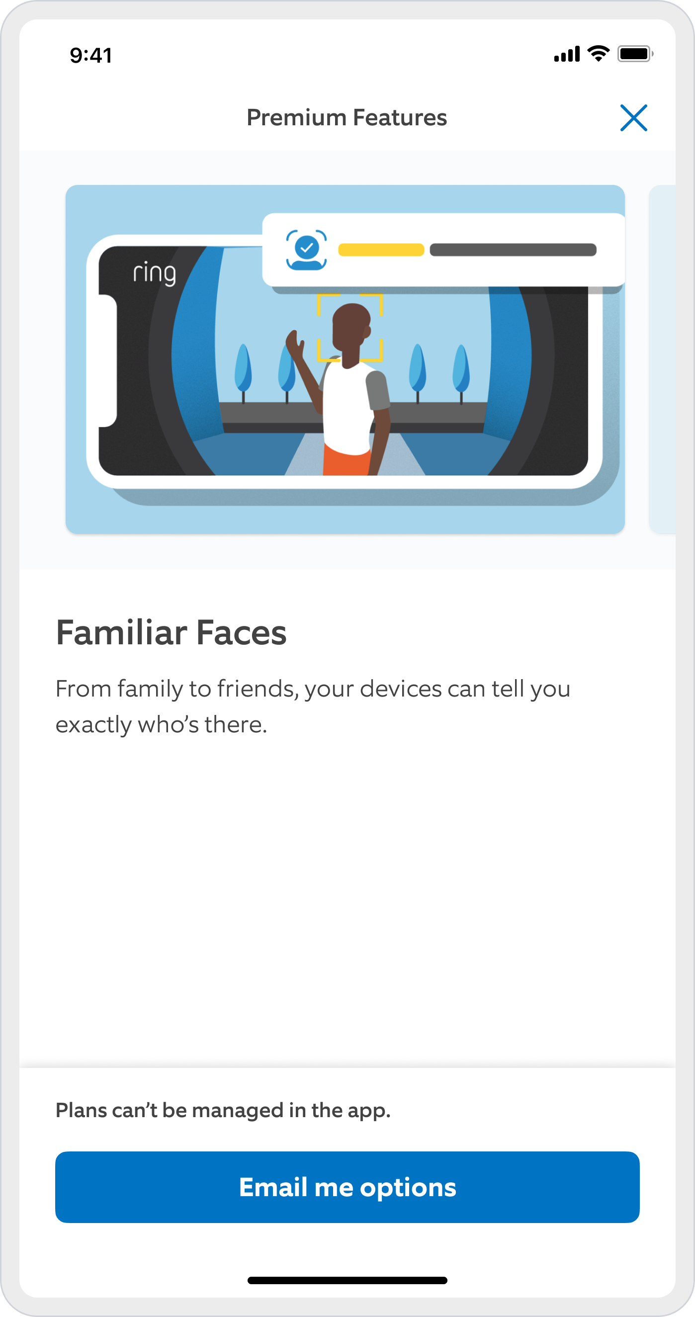
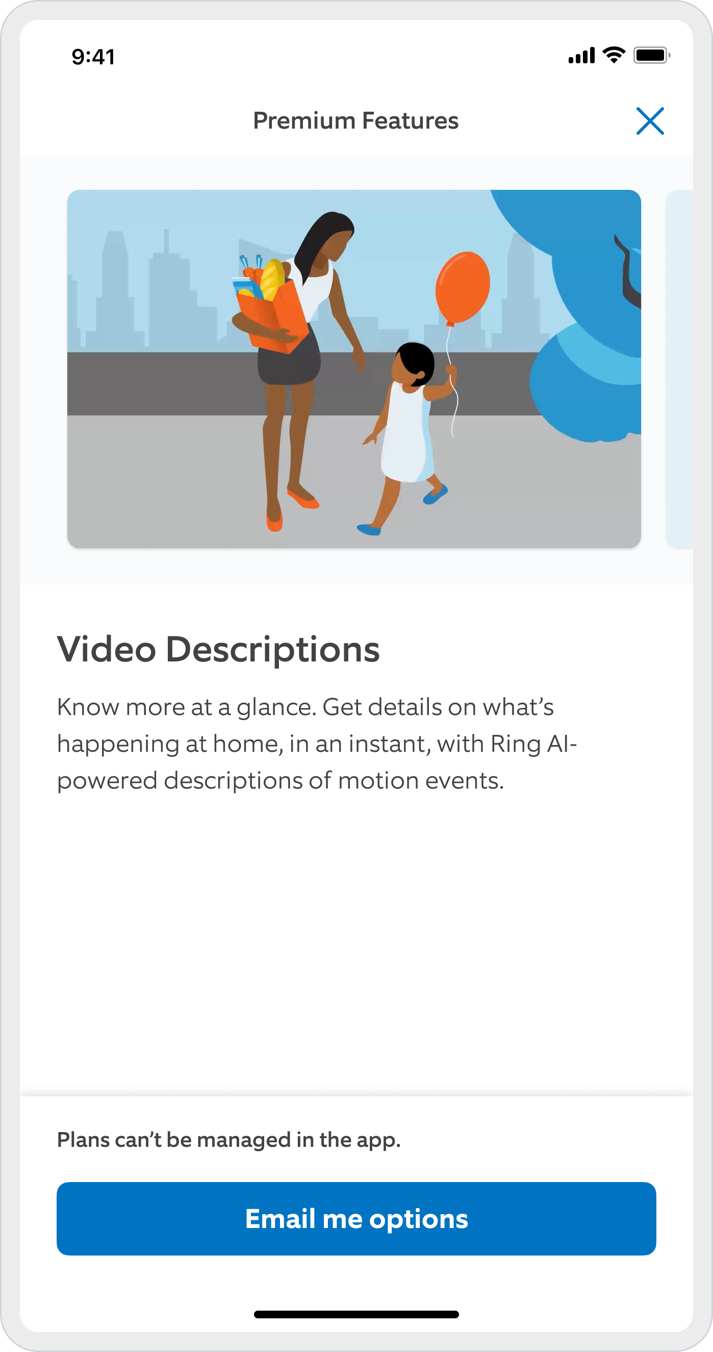
The first screen is the ingress: premium rows now carry a badge where they used to be missing. The rest are the gates behind them, one per feature.
We mapped every place in the app where a user bumps into a locked premium feature, then turned each one into a discovery moment that builds intent before checkout.
Time to value
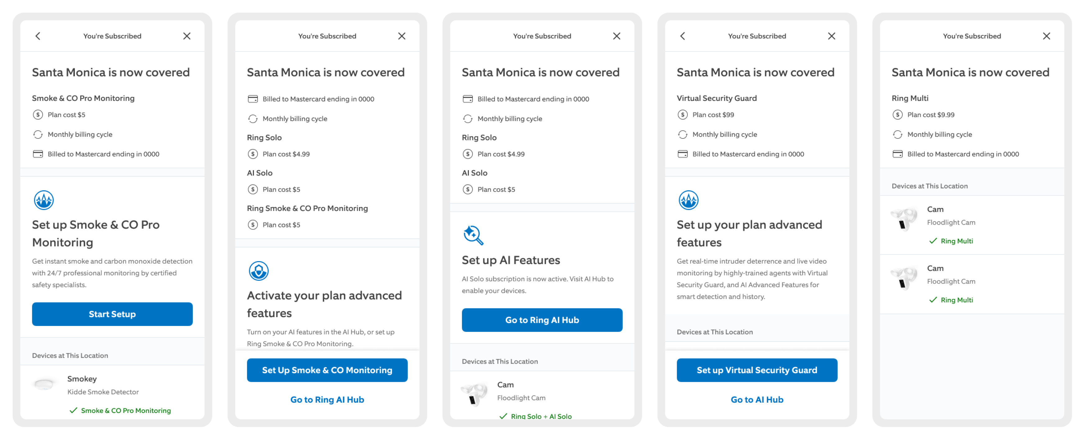
Five of the 24 variants, one per combination of plan, add-on and device. Each closes on the setup step that unlocks what was just bought.
The old success page said you're subscribed and stopped there. We rebuilt it as the first step of setup.
Three patterns for one continuous experience
Wiring five moments together needed connective tissue. Three patterns did that work, and two of them were built with the designers who own those surfaces.
The Pro features hub
The activation home for every Pro capability, so a purchase lands somewhere that turns things on. Built with Greg G, who leads that surface.
Premium while it lasts
Ruchika K led this pattern: it names what you are enjoying right now, and what disappears when the trial ends, right where your videos live.
Email me the plan
App Store policy stops the app from taking payment. This keeps the intent alive inside the rules: the plan goes to your inbox, and the purchase finishes on the web.
What outlived the launch
The redesigned ecosystem: a seamless end-to-end journey across Mobile and Desktop.
Live Oak went live in February 2025 across mobile and web, and the bets paid. We opened the top of the funnel wide and still moved the conversion baseline and the upgrade rate by double digits, which is the trade we had explicitly accepted going in. Plan mix and sign-up rate moved with them.
ARPU and recurring revenue are well up since. A 25% price increase shipped in the same release, so I won't pretend the design owns all of that.
Then the Blink team took my strategy and design as the cornerstone of their own move from in-app purchases to a web subscription flow. Talk about cross-team impact; how about cross-org impact.
Is it perfect? No. Most of these two years went into one thing: getting Product, Legal, GTM and two platforms to agree on what one journey looks like, then holding that line long enough to ship it. The next set of hypotheses is already written.